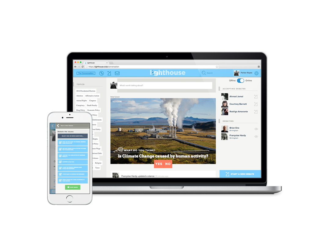
What is a responsive website?
Responsive website design is all about tailoring a website to meet the needs of various screen sizes. But, being responsive is much more than just resizing the elements of a page so that they all fit on smaller devices. It includes reordering, shifting, and reimagining the user interface of a site so that it works perfectly on any device. In doing this, responsive websites offer the same functionality to both desktop and mobile users in a way that works best for each device.
Sounds expensive. Can I afford it?
One crucial aspect of responsive websites is that they are not just more user-friendly, they are also significantly cheaper than creating separate mobile and desktop sites. Responsive websites achieve this by use the exact same code on all devices. This also means that when you want to add new functionality to your site, you will only have to do it once. Responsive sites are cheaper to build and cheaper to maintain.
Is it really worth it?
Given the cost effectiveness and accessibility of responsive websites, why would you settle for anything less? When considering the rapid increase in mobile and tablet users, being responsive is a must for any modern website. Mobile and tablet traffic often make up well over 25% of a site’s traffic and represent great opportunities to grow your business. If your site is not optimized to meet the needs of these visitors, they will quickly find another site that is.
Convinced that a responsive website is right for you?
Our team has created responsive websites of all levels of complexity. After numerous successful sites, BHW has built the knowledge and skills to design, develop, and deliver the type of responsive web site that your users expect and deserve. Contact The BHW Group to start working on your site today, and you will be amazed at just how far your investment goes.
What's Next?
Contact us today and discover how a partnership with BHW can tackle your business’ toughest challenges.