BHW Group Blog
Material UI Redesign
Submitted by Alex Delker on Tuesday, 11/01/16
Bringing Material Design to Rush Enterprises, Inc.
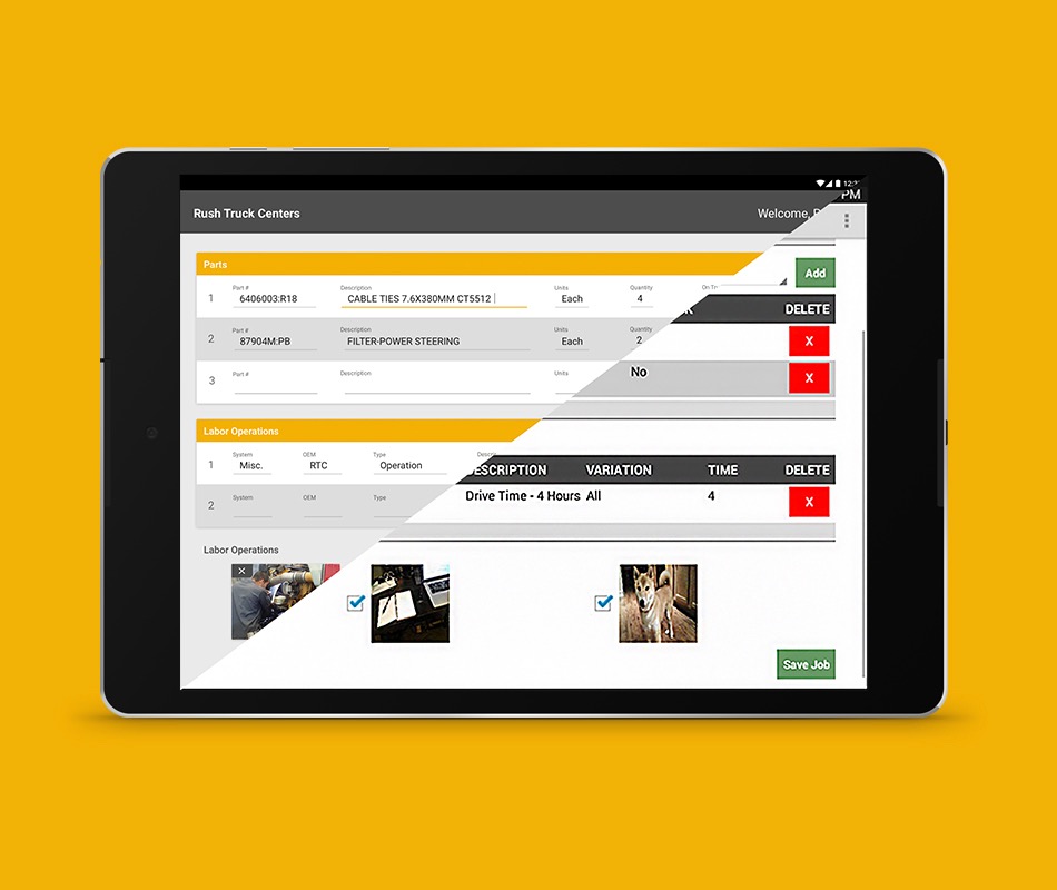
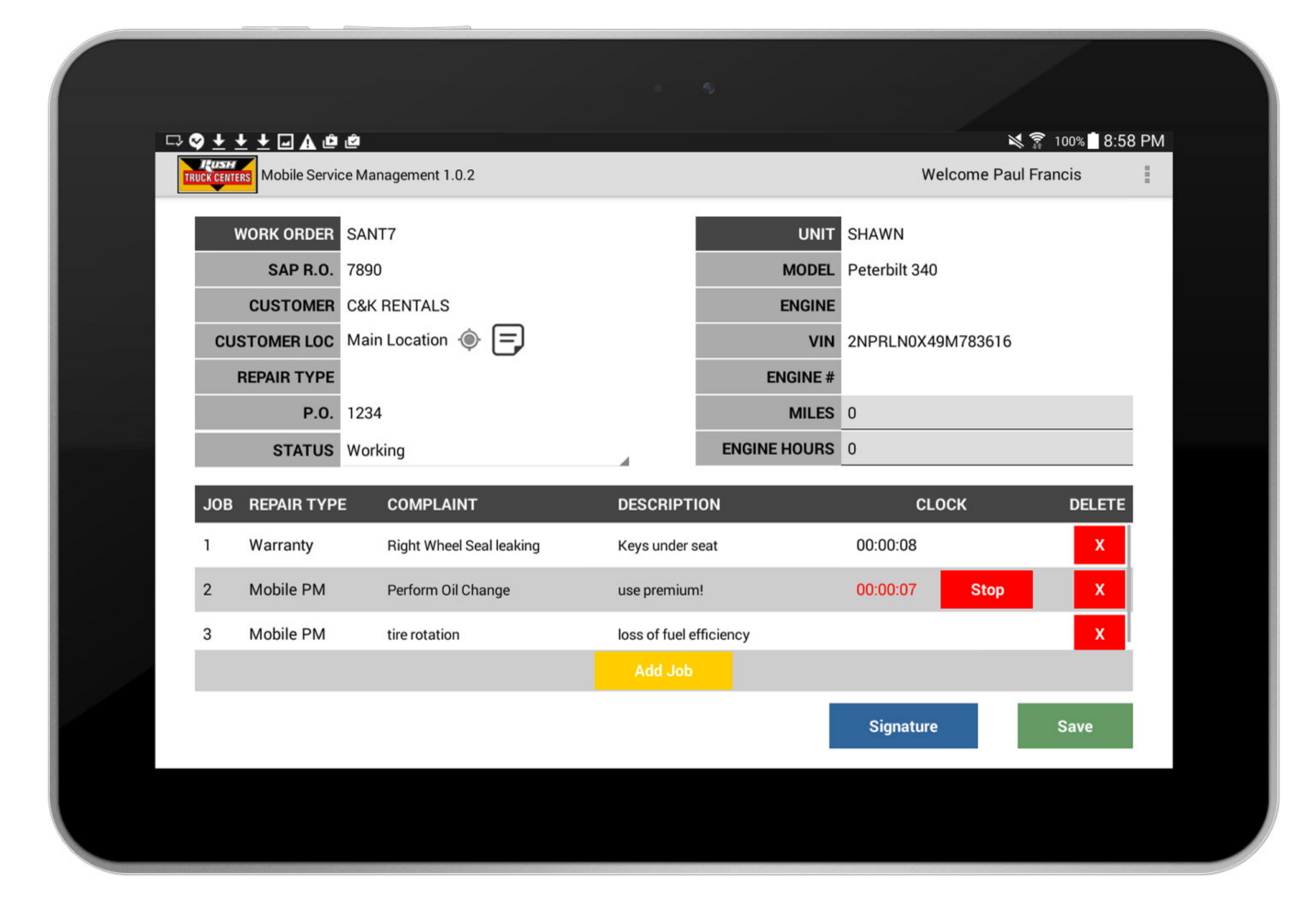
Rush’s mobile repair order app is used by technicians working remotely on vehicles. The app allows technicians to track their time for each task performed, invoice replacement parts used, keep track of inspections, and send reports to customers. Our task was to bring clarity to Rush’s internal app using material design principles. In this redesign, we used our 4 step process to make the transition as smooth as possible.
Bringing Material Design to Rush Enterprises, Inc.
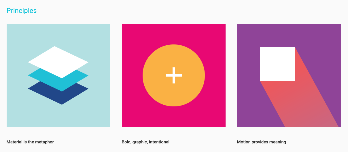
Material design is based off the “street smarts” of working with ink and paper. But beyond this, Google reinforces the simplicity of material design with a comprehensive set of guidelines (book smarts) detailing sensible ways to handle a deluge of use cases (found here) as well as hundreds of free resources and icons. There’s hints of skeuomorphism in the way layering mimics the behavior of paper, and elements on screen are animated with a charm that is reminiscent of ink doodles. Besides this, material design is a good bridge between skeuomorphism and flat design. It is simplistic and bold without too being too radical.
Why We Adapted Material Design
So, why did we choose to implement material design on this app in the first place? A few reasons:
- Users had a hard time telling which parts of the app were active or not
- Where there was visual hierarchy, colors were harsh on the eyes
- The app was lacking a well founded brand connection to Rush
Back to the Drawing Board
Translating to a new design language can sometimes be a rocky experience, so we set up a solid 4 step process to make sure the transition was as smooth as possible. This process can be applied beyond translating to a new design language; we oftentimes follow a similar approach to the branding process.
Step 1: Reduce
The first question we ask is, “what are the essentials?” At this stage, it’s a good idea to break the app down to its most integral colors and brand elements. Anything extra, including standard icons, will be replaced with material design elements later in the process. Testing the existing app is a good idea at any stage in this process. If in doubt of what could be made more lean in the reduction step, gather outside feedback.
Step 2: Evaluate Existign Patterns
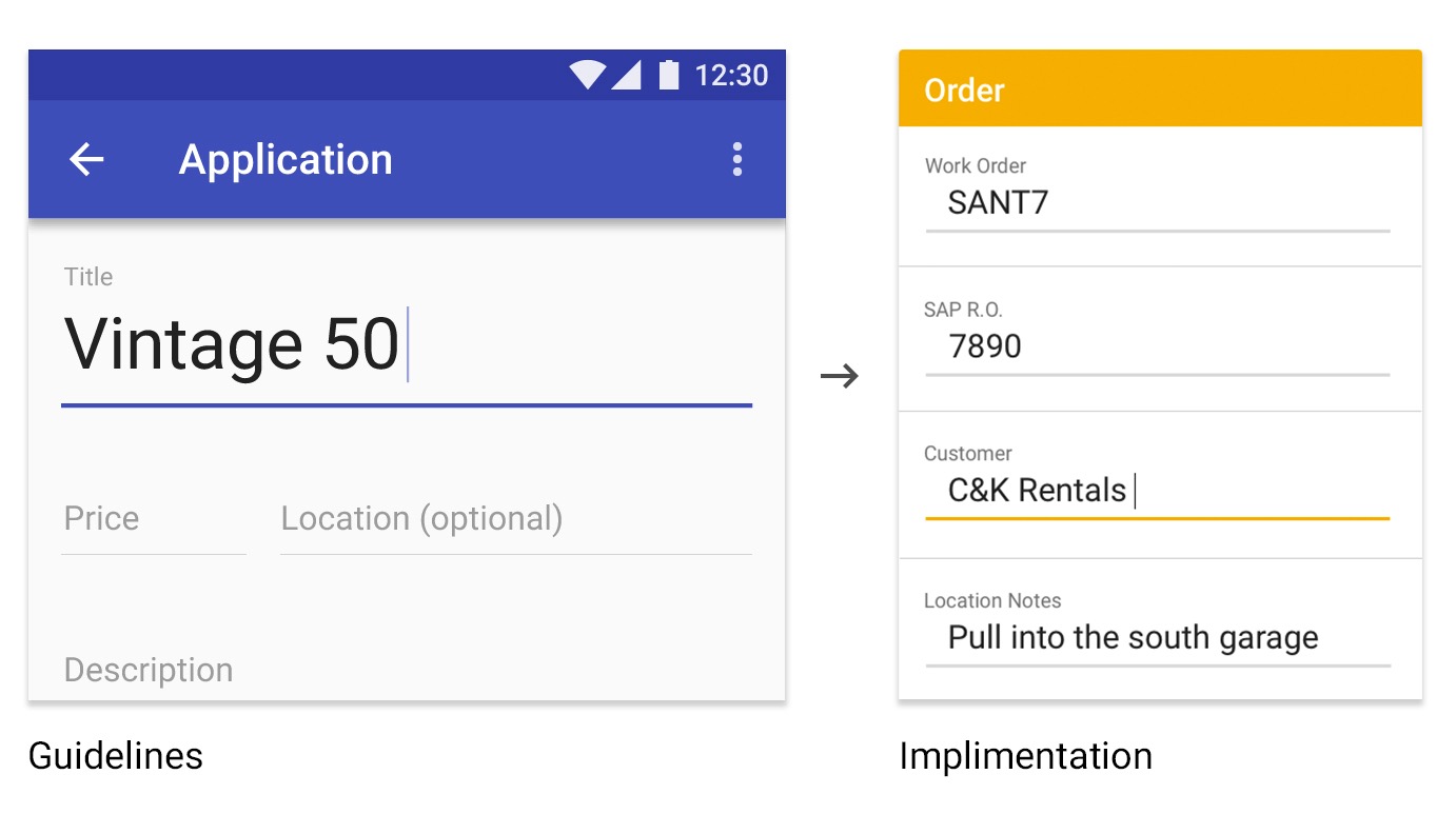
Next, we decide what user experience patterns will (or won’t) translate to the app’s new version. In this app, for example, we found that text fields could be better represented using material design principles. By doing this, there is no question which buttons/fields are active or not. At this stage, make notes of any user experience or user interface design trouble spots or red flags within the app.
When in doubt, test the app and gather feedback. The more feedback from a wider audience, the better. Red flags in an app show up when there are conflicts between what users think they can do and what the app developers intended the users to do.
Step 3: Research
After evaluating the app’s current assets and identifying red flags in the app’s UX and UI, we begin researching using quick hand-sketching techniques which we then verify using the material design guidelines. While the guidelines are comprehensive, they are not anchored rules. Trust your intuition if a use case falls outside the guidelines. On this project, it was unclear how to handle groups of text fields, so we organized according to what made sense. The original design’s text fields were difficult to distinguish between actionable and not, so we implemented material design’s fields. Each section becomes highlighted when interacted with, and the difference between input title and field is clearer.
Step 4: Implement
Once we’ve consolidated the app to its essence, spotted any troubling areas of the app, and researched ways to fix those problems, we implement. Refer back to sketches and app feedback. It is sometimes necessary to make multiple passes in this process.
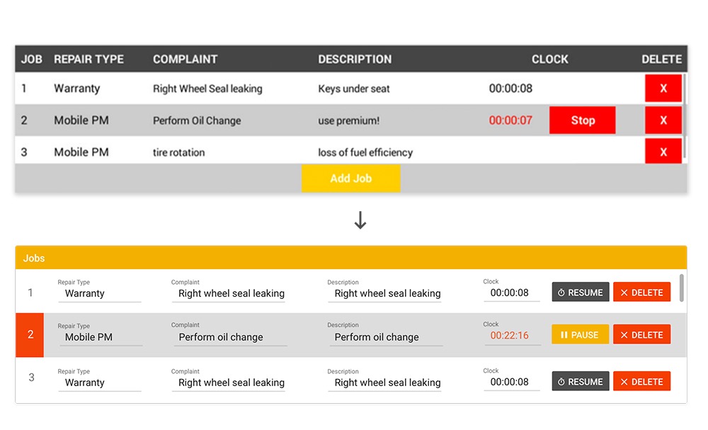
One of the main areas of concern in this project was making sure technicians could easily stop and start the timer (and tell when the clock was still running) on each job.
While there was visual hierarchy between currently running jobs and not, we took the overall design farther. We highlighted the running job in red, we dialed back some of the app’s colors to relieve the user’s eyes and, as mentioned above, we made it clearer that the text fields could be interacted with.
Wrapping it Up
From our experience, we’ve found material design to be a viable solution to UX and UI design problems. Having consolidated, evaluated, researched, and implemented these ideas time and time again without fail, we have found users to be more satisfied with their experiences. We strongly recommend using our 4 step process when translating to a new design language!
If you want to see more of this app, check out our project page. If you need some design help on your next mobile app, visit our mobile app design services page or contact us today!