Sprinkles Release Announcement
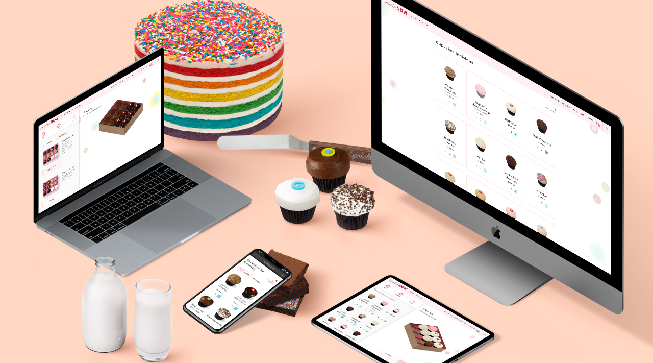
Our latest release is with Sprinkles, one of America’s favorite cupcake shops! Check out our work live right now at the ordering site.
Throughout the whole process from design to development, we worked closely with Sprinkles in order to understand their specific needs, workflows, menu, and customers. During this process, we evaluated the existing in-store and above-store technologies to identify the largest area of need for Sprinkles’ digital properties. We were able to design a solution that significantly improved their web ordering experience without disrupting their existing processes or other existing systems. We also designed our solution in such a way that we can continue to improve their host of digital products in the order of largest benefit.
We designed numerous ordering workflows to optimize ordering for various product types. Two of the most complex product types were for Sprinkles’ Cupcakes by Flavor orders and Sprinkles’ Fill a Box cupcake orders.
Cupcakes by Flavor was designed to make ordering higher quantities just as convenient as lower quantities.
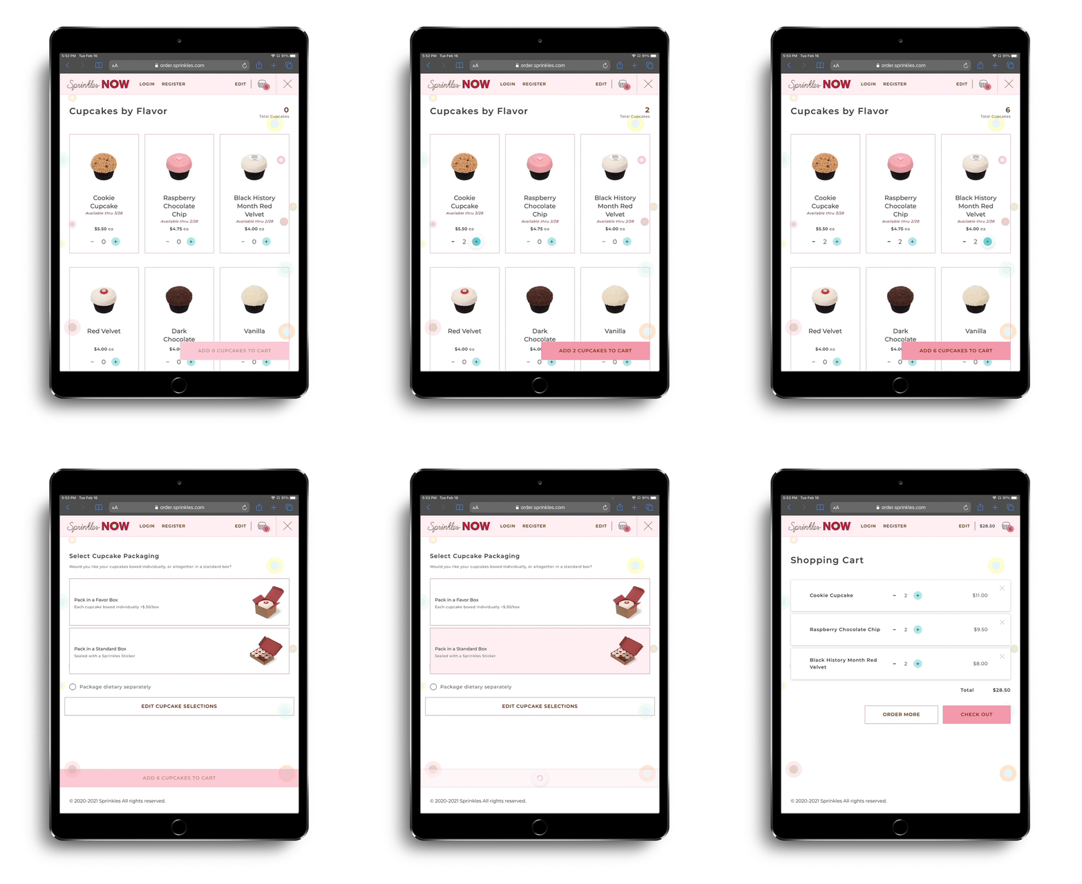
This design facilitates easily ordering any flavor in any amount. The clean layout displays each available flavor accompanied by photography, with descriptions available if a user clicks on them. Users can order using the plus and minus buttons, or manually type in a number. This makes ordering any number of any flavor incredibly smooth. The number of cupcakes are always displayed on screen as well, so that the user always has confirmation that their order is being updated with their selections. After selecting cupcakes, users are guided through box selection to make sure their cupcakes are packaged to order.
Cupcakes by Flavor and Fill A Box orders were a balancing act between offering the user as much customization as possible while still making the ordering process easy and intuitive. Below, we’ll unpack the process that went into making the complicated Fill A Box workflow easy for customers to use.
Research
During the research phase, we explored different User Interfaces and websites where the user had the ability to highly customize the product. We examined products inside and outside of the restaurant industry. From the start, we knew we wanted a visual emphasis on the food and the ability to make it highly personalized.
Information Architecture
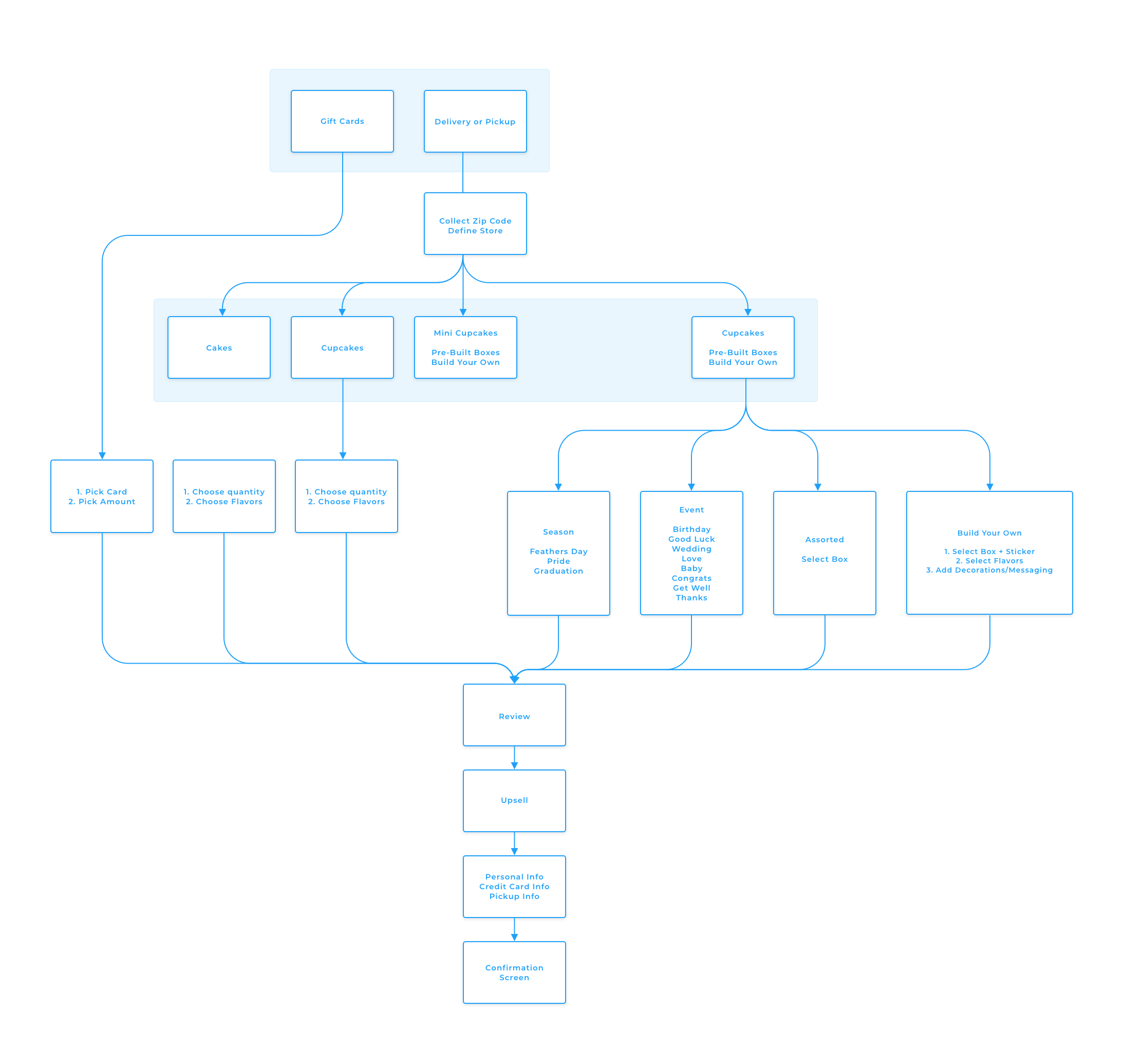
We began with a User Flow to identify the various User Experiences, which helped us gain an understanding of current features and functionality vs. what we needed to build.
Wireframing
We prioritized food-forward ordering and rewarding customization options. To do so, we streamlined the entire ordering process to allow the user to design, customize, and review their order in real-time.
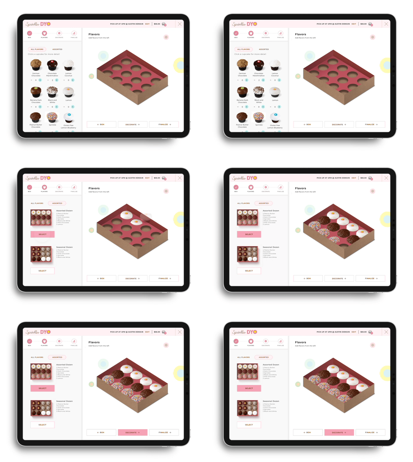
We concluded that the most important thing in the ordering process was to give the user control. To bring this to life, we came up with a user friendly and visually appealing solution. We made sure the user could simultaneously browse cupcake options, add them to a box, and view the final product. We also wanted ordering cupcakes to be an exciting process. Each cupcake pops into the box as the user adds it, in any order desired, and each step comes with more options to customize. Users now have a full visual understanding of exactly what they will receive while also introducing a fun element into the ordering process. We hope that this immersive and exciting online ordering experience will keep customers coming back for more.
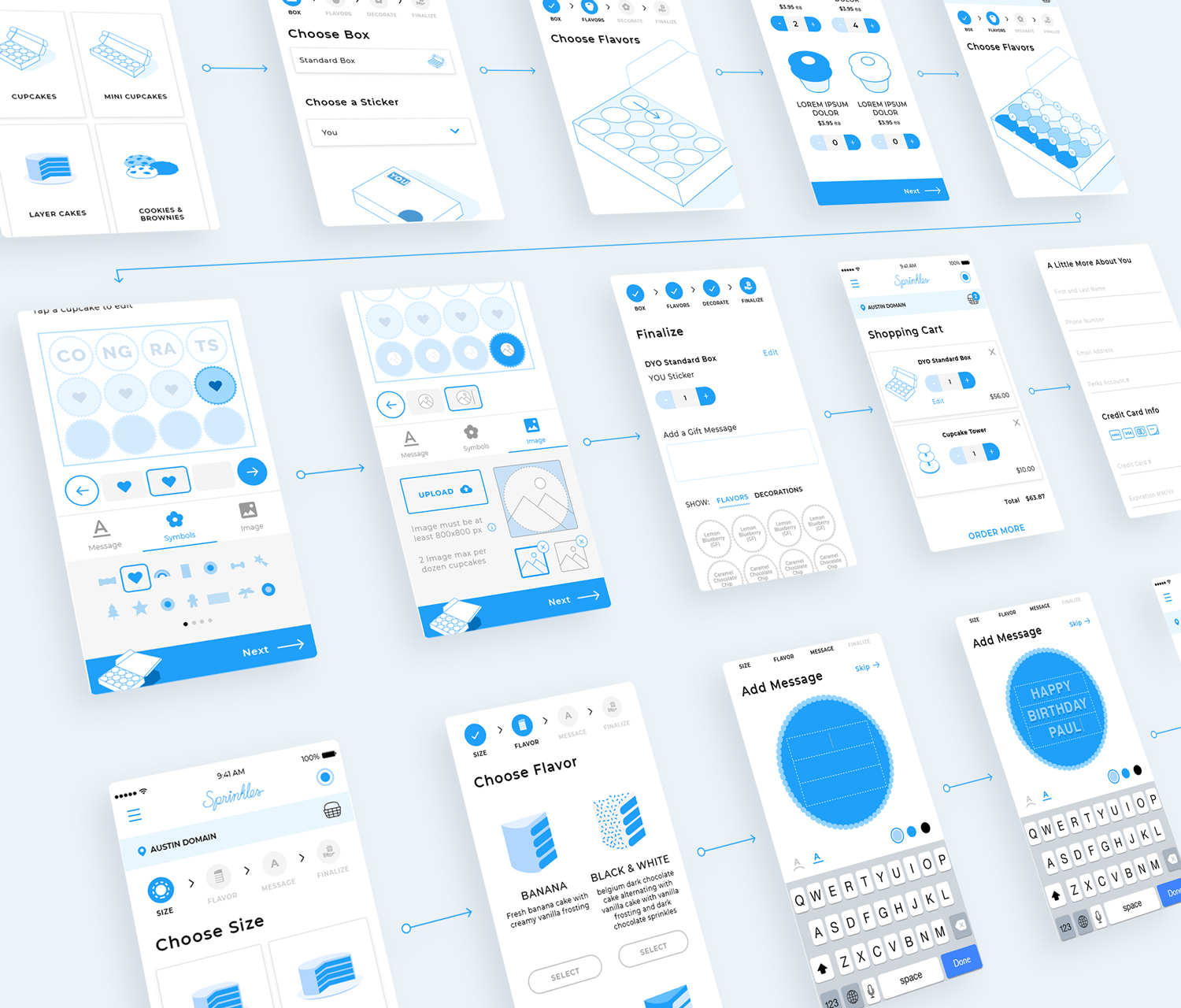
First, we started with mobile prototypes. With the mobile-first approach, we were able to fit all functionality and features into less screen real-estate to ensure they would translate to desktop seamlessly. From there, we were able to design for desktop while maximizing parts of the User Interface we wanted more visual emphasis on, such as the final cupcake arrangement. This was an iterative process: by continually prototyping out basic ordering flows in mobile and desktop, we could test the design constantly and resolve potential issues early on, before moving to styling.
Styling
For design, we wanted to keep it simple: focus on the product. Large, professionally shot photos on a white background showcase what Sprinkles has to offer. For the user to get a more rich experience with ordering cupcakes, we designed the box preview to be isometrically viewed, as if the user was sitting at a table and looking down at their creation.
With this 3D angle and our dynamic cupcake quantity pickers, our ordering system offers an almost tangible quality that a static photo just can’t compete with. By combining photos with pixel-perfect box renderings in Photoshop, we were able to layer transparent PNGs on top of each other, brought to life by our amazing developers.
Responsive Design
We live in an exciting time for product design where mobile can be just as feature-rich and easy to use as desktop - and that’s what we accomplished with this redesign. We did not compromise any functionality in any breakpoint. As a result, the user can enjoy a fully responsive experience.
Administrative System
On the administrative side, we built an easy to use admin system to continually configure and adjust the platform without developer involvement. Sprinkles can now independently update information like store hours, item availability, menu items, and special promotional periods with flexibility and efficiency. We also built in robust analytics to continually refine and monitor the platform.
One of the highlights of the admin system is the custom order scheduling and throttling. Because Sprinkles bakes many of their goods same-day for freshness, they needed a way to quickly communicate and coordinate available supply with projected demand at each individual store. Our system enables Sprinkles to manage and update available quantities and orders in real-time, and behaviors can be configured to respond to custom thresholds, such as automatically disabling more orders for certain time slots once they are filled.
Conclusion
Sprinkles is now able to fulfill orders in a more efficient manner and update bakeries in real-time. From design to development, we helped transform Sprinkles’ ordering system to give customers the ability to order exactly what they want, how they want, when they want it.
