BHW Group Blog
From Design to Web – Austin Sunshine Run
Submitted by Jason Gray on Monday, 03/02/15
In every profession that involves building something, there is a translation process where you take a designer or architect’s vision and make it a physical reality. Working for a web consulting company, we encounter a full spectrum of design/build projects for our clients. On one end, you have some hand-written notes and an idea of “I’d like the site to look sort of like {somesite}.com.” On the other end of the spectrum, you have a professional UI designer feeding you Adobe PhotoShop .psd files with gridlines and pixel spacings. I love the creative freedom of the “hand-written notes”, but I really love the challenge of turning a .psd into a .com. For the Austin Sunshine Run website, we had the opportunity to work with designer, Michael Harman, of Harman Friday to create a beautiful and functional site to market a fun run for a great cause. This article is going to highlight some of the steps and challenges along the way.
Background
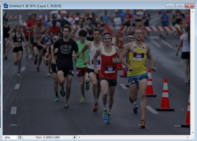
The BHW Group was approached by the Young Men’s Business League (YMBL) of Austin to help create a website for a new, annual fun run to support the Austin Sunshine Camps (ASC). ASC was established in 1928 by the YMBL of Austin and provides enrichment opportunities for low-income boys and girls of Central Texas. ASC provides year-round academic programs as well as their signature summer camp program and this downtown Austin run was coordinated to support their programs. ASC has served more than 46,000 children since their inception and I encourage you to visit their websites to learn more about the great things that they do. Our founder, Brett Burnett, embraces philanthropy with his team and the community so it was an easy decision to donate BHW’s time and talent to this worthy cause.
Step 1 - The Vision
The designer’s vision came to us in the form of a dropbox file share filled with an assortment of files ranging from .txt for website copy to .psd files for layout on full screen and mobile browsers. We then spent time refining that vision with the designer and answering any questions that our team had.
Step 2 - The Framework
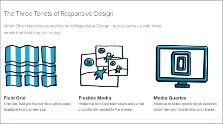
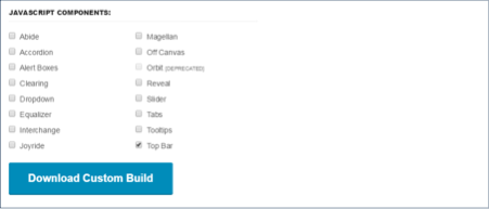
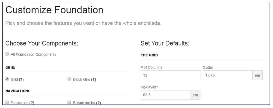
We wanted a site that was responsive and that looked great and functioned well on all browsers and devices. We chose a responsive framework named Foundation and we chose only the parts of Foundation’s framework centered on the top menu and the responsive grid itself to help reduce the final footprint of the site and include files. Responsive web design (RWD) is an approach to web design aimed at crafting sites to provide an optimal viewing experience—easy reading and navigation with a minimum of resizing, panning, and scrolling—across a wide range of devices (from desktop computer monitors to mobile phones).
Foundation’s site allows you to easily build a custom package with just the pieces that you need.
Step 3 - The Code
The code in a project like this is very different from many of the business-oriented applications that we build for clients. This site doesn’t have a back-end database or any web service integrations or any pieces of functionality that process xml or Json. It is graphical website with mostly static information focused on introducing people to the run and providing information to the runners and volunteers about the event logistics. There are a couple of related sites that handle volunteer sign-up, race registration and race results, which are linked from this site. The code is entirely HTML, CSS and Javascript. To make the site responsive and function across a wide array of browsers and devices, we had to create pieces that would scale well. We also had to introduce HTML logic to handle older browsers, with corresponding older versions of frameworks, like Foundation for example.
<!--[if lt IE 9]>
    <link rel="stylesheet" href="css/foundation3/foundation.css" />
<![endif]-->
<!--[if gt IE 8]> -->
    <link rel="stylesheet" href="css/foundation.css" />
<!-- <![endif]-->
There are a couple of interesting pieces of this site that took a little more finesse and planning to achieve the desired result:
1. Top Menu
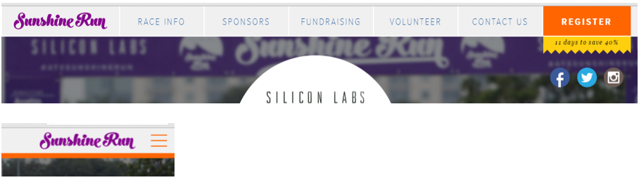
We created the top menu navigation using Foundation’s TopBar framework. We eventually created four versions of the menu to accommodate the designer’s vision on various screen sizes and older versions of browsers. We decorated each top menu container with a “show for” size that corresponded to Foundation’s framework. Foundation handles what items are eventually shown based on the browser screen size requesting the content. Here is a sample of what the HTML looked like.
<div class="contain-to-grid fixed show-for-xlarge-up">
      <nav class="top-bar" data-topbar>
          <ul class="title-area">
                <li class="name toplogo" onclick="goto('top');"></li>
           </ul>
           <section class="top-bar-section">
                <ul class="left">
                    <li class="divider"></li>
...

<div class="contain-to-grid fixed show-for-large-only">

...

<div class="contain-to-grid fixed show-for-medium-only">

...

<div class="fixed show-for-small-down">
Another interesting item from the top menu was the little banner announcement that alerts how many “days to save X%”, which is based on the predefined race registration dates. The jagged yellow banner hanging below the menu was accomplished with a [position: relative;] style, the background image, and the actual text inside the banner. The position relative is relative to the fixed top banner item it falls directly beneath, the orange “Register” button. The text replacement is handled with a simple javascript.
<p class="jagged" id="registersave">days to register</p>
.jagged {
  position: relative;
  top: 0px;
  right: 0px;
  background: url('../img/jagged.png');
  background-repeat: repeat-x;
//Number of days to save for registration
var d = new Date();
var march1 = new Date('03/01/2015'); //Early registration
var april30 = new Date('04/30/2015'); //Late registration after
//Before March 1st?
var diff = new Date(march1 - d);
var days = Math.ceil(diff / 1000 / 60 / 60 / 24);
if (days > 0) {
    if (days == 1) {
        $('#registersave').html(days + ' day to save 40%');
    }
    else {
        $('#registersave').html(days + ' days to save 40%');
    }
}
... and so on
2. The Countdown
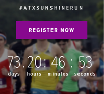
There is a countdown display on the front page to the actual event start time for the timed 5K and 10K race. We accomplished this counter in a similar fashion to the “days to register” feature. We first had an HTML element placed on the screen and some javascript that replaced the text inside those elements with the calculated times.
After some research, we found a perfect, light-weight plugin script that allowed us to handle the countdown timer exactly how the designer wanted to display it. There are other plugin options out there that do similar things, but this one was the right fit for our circumstance.
jQuery.downCount.js - github
We implemented the javascript include, setup the HTML and made a call to Sonny’s plugin in our script block by specifying the race start time. The plugin updates the “00” spans in the HTML with the calculated values.
<!—Sonny’s downCount include -->
<script src="js/jquery.downCount.js"></script>
<!-- Countdown Timer -->
<div class="row">
<div class="two large-2 medium-2 columns"> </div>
<div class="eight large-8 medium-8 small-12 columns">
<ul class="countdown">
<li>
<span class="days">00</span>
<p class="days_ref">days</p>
</li>
<li class="separator">.</li>
<li>
<span class="hours">00</span>
<p class="hours_ref">hours</p>
</li>
<li class="separator">:</li>
<li>
<span class="minutes">00</span>
<p class="minutes_ref">minutes</p>
</li>
<li class="separator">:</li>
<li>
<span class="seconds">00</span>
<p class="seconds_ref">seconds</p>
</li>
</ul>
</div>
<div class="two large-2 medium-2 columns"> </div>
</div>
$('.countdown').downCount({
    date: '05/03/2015 7:00:00',
    offset: -7
}, function () {
    //test;
});
Step 4 - The Carve
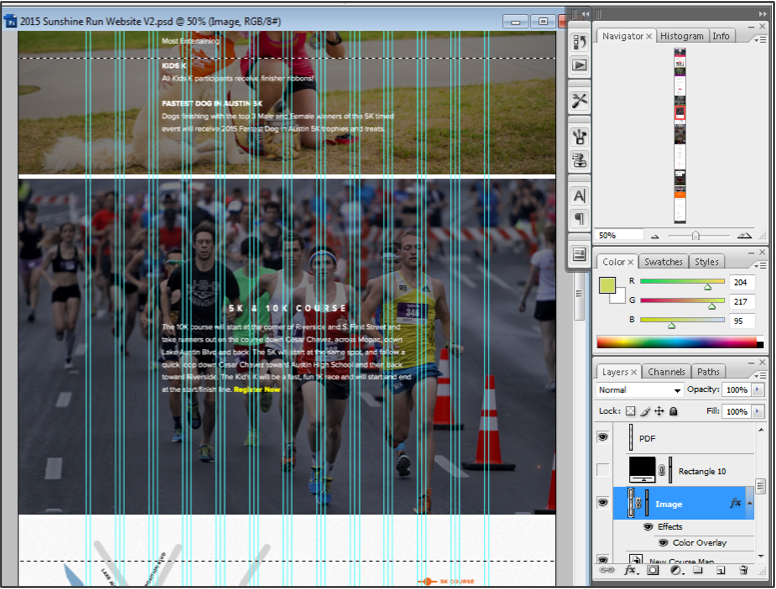
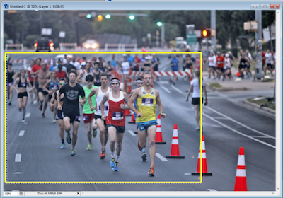
After we had the basic page layout, navigation and javascripts in place, the attention was directed at dismantling the psd file into individual graphic files optimized for the web. For each section of the website, we pulled out background images and copy/pasted layer effects and saved the individual pieces off as .png files. We then went to the HTML and CSS to define the section and layout and to insert the edited copy.
- We selected the background image and copied it to a new image.
- We cropped the new image as necessary to create a dimension that would work best on large to medium sized browsers.
- We copied any layer effects and color overlays and pasted to the new image.
- We saved the image as bg_{section} .png.
- We further cropped the image to a more vertical layout to be displayed on small screen or mobile/phone devices.
- We saved the second image as bg_{section}_small .png.
We then went back to the HTML to create the section and the corresponding CSS classes to define that section.
<div class="image_bg bg_course" id="div_course">
<div class="image_bg_text">
<div class="row">
<div class="two large-2 medium-1 columns"> </div>
<div class="eight large-8 medium-10 small-12 columns">
<h2 id="race_coursestart">5K & 10K COURSE</h2>
<p>section content...</p>
</div>
<div class="two large-2 medium-1 columns"> </div>
</div>
</div>
</div>
.image_bg {
    background-size: cover;
    background-repeat: no-repeat;
    position: relative;
    width: 100%;
    height: 0;
    padding-top: 66.64%;
    border-top: solid 2px #fff;
}
.image_bg_text {
    position: absolute;
    top: 20px;
    left: 0;
    width: 100%;
    height: 0;
}
.bg_course {
    background-image: url('../img/bg_course.png');
}
.bg_course_small {
    background-image: url('../img/bg_course_small.png');
}
I highlighted the id of the div above in green to help demonstrate the background image switch on small devices. By removing the one class and adding the second “small” class we are essentially switching out the horizontal image for the vertical one to properly account for the layout on small devices.
$('#div_course').removeClass("bg_course");
$('#div_course').addClass("bg_course_small");
This process was repeated for each section of the website until we finally had a product ready for review.
Step 5 - The Iteration
We then began testing our new site on different browser versions and different screen sizes and with multiple iOS, Android and Windows Mobile devices and emulators. We tweaked the design to make it look as identical as possible in each of the tested environments. We then worked with the designer to move items around even more to match pixel spacing more closely with the psd file or to prevent some items from overlapping others on specific screen sizes. The iterative process was very productive and I think that the development team and the designer both learned some new things about the challenges of the process.
Conclusion
What a great and challenging project! We took a designer’s vision to the web in the matter of a few weeks of calendar time and not too many hours of development work. I can’t speak to the effort of the Michael’s design time, but I am sure that it was not inconsequential. The BHW team had a fun and rewarding experience, we learned some new things about Foundation and we built a website to help promote a fun run for a great cause. We are anticipating a successful event that continues to raise funds for the Austin Sunshine Camps for years to come.
Do you need an expert in web development? With a team of web development specialists covering a wide range of skill sets and backgrounds, The BHW Group is prepared to help your company make the transformations needed to remain competitive in today’s high-tech marketplace.